Friday, October 28, 2016

Module 7: The Fault in our Stars.

The Fault in Our Stars by [Green, John]
(Photo courtesy of Amazon.com)

Summary: Hazel is a 17 year-old girl who is battling thyroid cancer, and her mother has decided to have her to go to a cancer patient's group for therapy. As much as she is reluctant to go, she complies. While there, she meets a boy, Augustus Waters who is now in remission after having his leg amputated because of osteosarcoma. The two are able to kindle a friendship, and they build a relationship. Hazel asks Augustus to read a book, An Imperial Affliction. She explains how the author, Peter Van Houton, fled to Amsterdam shortly after the books success. Augustus is able to track down the assistant, Liedwij, to Houton. This opens up a correspondence via e-mail between Hazel and Houton. He invites her to visit him should she ever find herself in Amsterdam. This gets the wheels rolling to get Hazel to meet this reclusive author. Who else could possibly manage to get her to Amsterdam but Augustus, who has used his charitable foundation wish to grant Hazel hers. And he does it in a very romantically themed Dutch picnic. What will happen on her trip? Will she get her answers about the young girl suffering from cancer in the novel?

APA: Green, J. (2012). The fault in our stars. New York, NY: Penguin Group.

Review: This is easily one of the biggest titles of the year — six starred reviews! Big time buzz! John Green! Previous Printz winner! Nerdfighters! — so we’ve been thinking about it for a while. Since this is a book from a former Printz winner and honoree, we knew we’d be reading it with our Printz glasses on. When you add the serious subject matter, the thoughtful treatment of said subject matter, the memorable characters, and the five-hanky tear-jerker of a plot, you know there’s a lot to talk about in terms of Printz-worthiness.
Hazel has terminal cancer. Augustus is a cancer survivor who has lost a leg to the disease. They meet in a teen cancer support group. It’s complicated and baggage-filled love almost at first sight. She doesn’t want to die on him; he wants to save everyone. It’s clearly a recipe for heartbreaking disaster. Their mutual love of (fictional) Peter Van Hauten’s (fictional) An Imperial Affliction gives the two an excuse for a road trip, but plot happens and PLOT PLOT PLOT.
When you read a John Green book, you know that the writing is going to be shiny and sharp. The dialogue will be rapid-fire and dramatically intelligent. Fault does not disappoint. Augustus and Hazel engage in electrifying debates (he fears oblivion; she choses to ignore it) and hilarious reparte (“The day of the existentially fraught free throws was coincidentally also my last day of dual leggedness,” Augustus says).
Actually, that second quote is pretty magnificent: intelligent, wry, but wrapped in sadness. Gus, Hazel, their friend Isaac: all of them casually shrug off Cancer Perks (trips to Disneyland, autographed basketballs) while attempting to grapple with the pitfalls of teenagerdom and, you know, also mortality. The teen characters are smart, funny, and determined to maintain their dignity and kindness. Hazel describes the horrible awareness kids with cancer have: “There is only one thing in this world shittier than biting it from cancer when you’re sixteen, and that’s having a kid who bites it from cancer.”
Green’s depiction of friendship is dead-on (as usual, although of course that has nothing to do with Printz conversation). Hazel, Gus, and Isaac, as a threesome, are sarcastic, honest, and loving with each other. Minor characters, like Gus’s parents and Hazel’s friend Kaitlyn, have very limited page time, but are still memorable and well drawn. This is a teen book with really (like, really) fantastic parental characterization.
Hazel and Augustus’s weighty conversations and observations allow Green to weave many themes together. The idea in the title, the fault in our stars, the harmatia that lives in all of us shows up in so many different ways and through different images (people as grenades; broken, drunk and abusive Van Hauten; cancer itself) and doesn’t feel forced or false. There is a lot in this book to love.
Unfortunately, there is a problem. Van Houten, the author of An Imperial Affliction, the person Gus and Hazel travel to Amsterdam to see, comes back for the [REDACTED EVENT, in case you live under a rock, but know that comments are fair game for spoilers]. So much weaksauce. Early on in the novel, Hazel tries to describe her love for An Imperial Affliction:
“But it’s not a cancer book, because cancer books suck. Like, in cancer books, the cancer person starts a charity that raises money to fight cancer, right? And this commitment to charity reminds the cancer person of the essential goodness of humanity and makes him/her feel loved and encouraged because s/he will leave a cancer curing legacy.”
But the decision to bring Van Hauten back makes this book suddenly feel like A Cancer Book — full of lessons and realizations and Important Character Growth. It’s cliche and I believe it severely weakens the integrity of the book.
I still cried, believe me. The eulogies on command scene? Tears. The last letter at the end? Tears. This book is powerful, strongly written, and has so much good stuff going on. But Van Hauten’s reappearance occurs at a crucial moment in the book, and feels too pat and perfect. It changes Fault from something that is transforming the cliches of a cancer book into a Cancer Book. Printz winners are books that move beyond what we expect, and the Van Hautening has the opposite effect.
However, there is so much good in this book, so much that is extraordinary. Is the flaw forgivable? Is that small portion of the plot forgivable? Oh, to be a fly on the wall of the Printz room!

Citation: Couri, S. "You may have noticed John Green wrote a book this year." School Librarians Journal. Retrieved from http://blogs.slj.com/printzblog/2012/09/16/you-may-have-noticed-that-john-green-wrote-a-book-this-year/

Library Use: This book shows how people deal with grief, friends, families, boyfriends/girlfriends. It deals with disappointment, sadness, loss, and upset, but it also shows how to enjoy life no matter what it offers.

Tuesday, October 25, 2016

Module 5: Chato's Kitchen


(Photo courtesy of Amazon.com)

Summary: Chato is a stereotypical cat from East Los Angeles. He has decided to invite his neighbors over for a dinner, they are a family of ratoncitos (mice). Chato, along with his cat friend Novio Boy, plan the meal as the mice plan their meal. The mice bring along a friend from their old barrio, Chorizo, and dachshund dog.

APA: Soto, G. (1997). Chato's Kithcen. New York, NY: Puffin Books.

Review: Soto (Too Many Tamales) commands a poet's gift for defining characters quickly, densely and, in this case, with hilariously choice words. Paired with Guevara's (The Boardwalk Princess) wickedly funny, urban paints, Soto's story of Chato, a cool, ``low-riding cat'' of East Los Angeles, is a scream. Chato and his friend Novio Boy plan a dinner for (and, they hope, of) the new mice next door. But the mice bring a surprise guest named Chorizo (sausage), who turns out to be a truly low-riding dachshund. Foiled, the cats resign themselves to mouseless fajitas. It's a basic enough tale, but close to brilliant in its execution. Guevara's cats are delicious send-ups of barrio characters, and Soto's words glisten with wit: ``We brought Chorizo,' Mami mouse called./ Sausage! Chato and Novio Boy danced, and with clean paws they gave each other a `low-four.'"" Salud to this magical pairing of talents. Ages 4-8. (Mar.)

Citation: N.a. "Children's book review: Chato's Kitchen." Publisher Weekly. Retrieved from http://www.publishersweekly.com/978-0-399-22658-8

Library Use: This book would be a great edition for librarians to talk about animals and even customs and cultural aspects of Latino families. Although slightly stereotypical, it is still a fun representation.

Sunday, October 23, 2016

Module 4: Sarah, Plain and Tall

Image result for sarah, plain and tall
(Photo courtesy of Amazon.com)

Summary: When a widower writes a letter for a wife to help on his farm and with his family, he receives a response from "Sarah, plain and tall." This novel shows how they they learn to accommodate their lives around each other and become a family. Set at a time that people were still trying to settle America, Jacob, the father, is trying to keep his farm afloat and make sure that the crop will be sufficient for his family. Written from the perspective of the daughter, the novel dives into what kids would worry most about. Can Sarah and Jacob fall in love? Will this relationship work?

APA: MacLachlan, P. (2015). Sarah, plain and tall. New York, NY: HarperCollins.

Review: Parents need to know that Patricia MacLachlan's Newbery Medal-winning novel Sarah, Plain and Tall -- set in the rural Midwestern prairie during the 19th century -- is the simple story of a widower called Jacob; his children, Anna and Caleb; and Sarah, the woman from Maine who answers Jacob's newspaper ad for a wife. After letters are exchanged between father, children, and Sarah, Sarah journeys from the east coast to their farm to get to know them and decide whether she'll marry Jacob and join the family. The story highlights everyday life on a farm, the children's growing attachment to Sarah, and their wariness that she will find their home too small or too big a change and decide to return to Maine. There's very mild violence in the story itself (a lamb dies), though readers learn that the children's mother died before the book begins. The main source of tension is the children's yearning for a mother and their uncertainty about whether Sarah will choose to stay.

Citation: Schultz, B. "Sarah, plain and tall." Common Sense Media. Retrieved from https://www.commonsensemedia.org/book-reviews/sarah-plain-and-tall

Library Use: This book would be a great edition for librarians to explain what times were like when America was just becoming a nation. It is a great time to discuss droughts and expectations of crops for survival.

Sunday, October 16, 2016

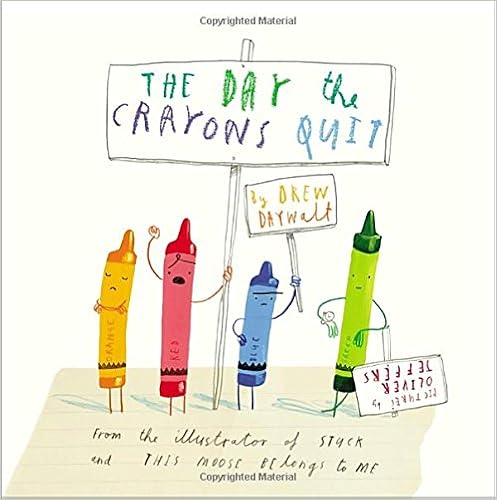
Module 6: The Day the Crayons Quit


(Photo courtesy of Amazon.com)

Summary: This book is from the perspective of the crayons! They are writing to their owner to let them now how they are being mistreated. Each color has something that they would like to say, so they write their letter to explain what they want. Each crayon even attaches examples of what they are upset about. So what can the owner possibly do?

APA: Daywalt, D. (2013). The Day the Crayons Quit. New York, NY: Philomel Books.

Review:

It is possible to read too much into a picture book. A funny statement since what were talking about is literature for people who haven’t even seen a decade of time pass them by. But historically picture books have been places where prejudices are both intentionally and unintentionally on display. Yet for every Denver by David McKee (a picture book about the beauty of trickle down economics) you’ll find fifty people reading WAY too much into something like Rainbow Fish(Communist propaganda) or Click Clack Moo (inculcating kids into unionism). The thing is, picture books are meant to teach and inform our children. Yet along the way a parent or gatekeeper might be worried about the unintentional messages getting pushed along the way. At the end of the day you have to weigh your reactions carefully. You can’t be pointing fingers left and right, claiming authorial intent where there is none. Okay. So round about now you’re trying to figure out what the heck any of this has to do with The Day the Crayons Quit by Drew Daywalt. I mean, talk about an innocuous title. Why am I going on and on about unintentional messages in works of children’s fiction in preface to talking about this book? Well, here’s the trouble. I have a major problem with this story and it’s entirely possible that it’s just in my own head. So here’s what I’m going to do. I’m going to lay out the facts as they stand and you can judge for yourself whether or not this book does indeed make a major you-can’t-do-that-in-the-21st-century mistake, or if I’m simply suffering from a case of Reading Too Much Into It. Either way, it sure makes this Daywalt/Jeffers collaboration into an interesting point of discussion.
Duncan’s your average kid. Not the kind of person who’s going to expect that when he reaches for his crayons at school he is, instead, going to find himself with a bundle of letters. Each letter is from a different crayon voicing their complaints. Says gray, “I know that elephants are gray but that’s a lot of space to color in all by myself.” Or pink saying, “Could you please use me sometime to color the occasional pink dinosaur or monster or cowboy?” Red and blue need a rest, white feels empty, yellow and orange both claim the sun, and all black ever wanted in life was, for once, to color in a rainbow or a beach ball. By the end of the letters Duncan wants to make the crayons happy. And that’s when he comes up with the perfect solution to everybody’s woes.
Now let’s talk crayon history for a bit. This is fun. In 1962 the U.S. Civil Rights Movement was underway. America was going through big changes. Assumptions that had lain dormant for years were finally getting challenged and even crayons were getting a double glance. You see 1962 was the year that Crayola decided to officially change the crayon known as “flesh” to “peach”. You see where I am going with this, I suspect. While white children certainly would use the color as flesh, it wasn’t exactly on the up and up to assume that white was the de facto skin color. Fast forward to 2013 and the publication of The Day the Crayons Quit. Peach does indeed make an appearance in this book and in that section complains vociferously that its wrapper has been removed. “Now I’m NAKED and too embarrassed to leave the crayon box. I don’t even have any underwear!” That Daywalt is linking peach to flesh again is no crime. Interestingly, on the previous page the pink crayon has been making a very different complaint about never being allowed to draw cowboys or dinos or monsters. The monster that it HAS drawn is covering its private parts, obviously believing itself to be naked as well, as the dinosaur points and laughs. So. Pink and peach are clearly equated with flesh tones.
Then what’s the deal with brown?
There is only one vaguely brownish crayon in this book and it is the much maligned beige. The official brown does not make an appearance it would seem. Beige’s sadness is the fact that while “Brown gets all the bears, ponies and puppies . . . the only things I get are turkey dinners (if I’m lucky) and wheat.”
Mmm hmm.
This is precisely where the difficulty comes into play. How much am I reading into this through my own prejudices? Let me give you a bit of comparison. This year is also seeing the publication ofThe Black Rabbit by Philippa Leathers. In that particular book a little white rabbit keeps seeing a “scary” big black rabbit that he runs away from. The black rabbit is, in fact, the little rabbit’s own shadow and at the end he comes to love the big black rabbit after all. A librarian recently commented to me that it would have been far preferable if the little rabbit had been brown or some other color. Otherwise you have a book where a white character fears a big black one. At first I was inclined to agree, but after thinking about it I wasn’t so sure. After all, the white rabbit’s fears are entirely in its own head. There’s also the fact that the book, I believe, is originally Australian, so the author wasn’t working with a lot of the codes and keys common in American culture. I was even reminded of the huge brouhaha surrounding The Rabbits’ Wedding by Garth Williams. In 1958 the Alabama state library system removed the book from circulation because it featured a black rabbit and a white rabbit getting married. But sometimes a rabbit is just a rabbit.
So is a crayon just a crayon? I think the difference may lie in what a kid gets out of reading this book. In the case of The Black Rabbit, few kids are going to equate themselves with fluffy bunnies. Even if they do, the black rabbit is ultimately the hero of the story. There’s a bit of a difference with crayons. Kids are constantly coloring themselves and the people they love with the crayons they have on hand. Crayola, knowing this, even released a brand of multicultural crayons of varying brown tones in response to the public’s desire for that very product. So to produce a book where pink and flesh are equated with skin tones and that possibility isn’t even considered with beige or brown makes for a complicated reading. It’s an easy mistake to make if you’re not thinking about it at first, but you would have thought that someone in the course of editing this thing might have brought the point up with Mr. Daywalt. Heck, they might have brought it up with Jeffers too, since he’s the one who came up with the naked monster picture in the first place.
Getting away from brown, beige, and peach crayons entirely, let’s look at the book in terms of its other merits. When I was a kid I definitely ascribed personalities to inanimate objects. Not just dolls and toys, oh no. I could turn a game of War into a long drawn out romantic epic, thanks to the personalities ascribed to various playing cards. And crayons were no exception. Each one had a different part to play. They dealt with jealousies and romances, the whole nine yards. So in that frame of mind, The Day the Crayons Quit speaks to something very real. Kids like to believe that the objects that they play with are as invested in the experience as the kids themselves. So Daywalt has clearly found a unique but necessary niche. If he follows the book up with a story of playing cards we’ll know he’s on the right track.
This is also an epistolary picture book. I don’t know if Daywalt knows this, but a common assignment given by a variety of different elementary school teachers requires kids to read epistolary books (Dear Mrs. LaRueThe Journey of Oliver K. Woodman, etc.). As such, The Day the Crayons Quit is no doubt destined to remain on multiple children’s book lists for decades and decades to come.
Which is a bit of a pity since the book itself is tailor made for an adult readership. Sure, some kids are going to get a real kick out of it. But as I read through the book I kept thinking that were it not for the art of Oliver Jeffers, this title would be a difficult read. After all, it’s pretty much all about the words. Jeffers does what he can to give as much life and vitality as he can to the text, but there are twelve letters in here and around the orange and yellow crayons you’ll be forgiven if your attention starts to wane.
That’s why the success of the book (and success it indeed is) can be ascribed primarily to its illustrator. I began to notice that the childlike style of the art can really, believably be the style of a kid. This is undoubtedly why Jeffers was picked for the project in the first place. Aside from David Shannon it can be difficult to find artists that replicate children’s art styles without coming off as half-cooked. Jeffers has also taken great pains to put in as many small clever details as possible, and it makes for a very rewarding rereading. At first you wouldn’t notice. His Santa on a fire truck is straightforward. The dragon accidentally burning a clump of grapes is cute but for me the book really picks up with (no surprise here) the moment when Jeffers gets to draw a penguin. Even the paper he chooses for each crayon is interesting and significant. Admittedly I was a little surprised that the purple crayon’s letter wasn’t written on lined paper (since it’s such a stickler for staying inside the lines) while the gray crayon’s was. His faux coloring books are fun in and of themselves but it’s the final picture that’s worth it. There are a lot of hat tips to the crayons’ demands to be found here, from black rainbows to white cats. I think the character of Duncan still totally forgot to pay heed to blue’s request, but otherwise it’s on the up and up. You could even ignore that all the humans are drawn with pink or peach or white crayons, if you had half a mind to.
That’s sort of what makes the problems I have with the book such a bummer. There’s really good stuff going on here! Oliver Jeffers is fun to watch no matter what he does and Daywalt has the makings of a fine author for kids. The troubles come when you look at what the book is saying. Fans of a certain stripe are sure to disregard my concerns with a wave of their hand. “She’s reading WAY too much into this”, they might say. Probably. But it seems to me that you cannot write a book about crayons and mention peach and pink as naked without acknowledging that not every kid in the world thinks of those colors as a flesh tones. I mean, that’s just obvious. Here’s beige again: “I am BEIGE and I am proud.” Beige power, eh? Come on, little crayon. Time for you to think outside the box.
On shelves now.

Citation: Bird, E. (2013, August 5). Review of the Day: The day the crayons quit. School Library Journal. Retrieved from http://blogs.slj.com/afuse8production/2013/08/05/review-of-the-day-the-day-the-crayons-quite-by-drew-daywalt/

Library Use: This book would be a wonderful addition to any library, and it could help in teaching students about how hungry little caterpillars become beautiful butterflies. It works as a science book or as an introduction to colors, shapes, foods, and insects.

Tuesday, October 11, 2016

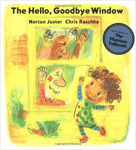
Module 3: The Hello, Goodbye Window

(Picture courtesy of Amazon.com)

Summary: This is a story about a window that a young girl says hello and goodbye at to her grandparents. The grandparents tell her it is a fascinating window where magical things can happen. She says that dragons, a queen, and the pizza delivery guy come by to visit at the window. She wants to have a window just like her grandparents when she grows up.

APA: Juster, N. (2005). The Hello, Goodbye Window. New York, NY: Hyperion Book.

Review:
“Nanna and Poppy live in a big house in the middle of town.” In Juster’s paean to loving grandparents, the young narrator relates the small, comforting routines she shares with her grandparents when she visits, from coloring at the kitchen table to counting stars with Nanna to finding all the raisins Poppy hides in her breakfast oatmeal. The quiet, gently humorous first-person narrative presents a very young child’s worldview (“when I get tired I . . . take my nap and nothing happens until I get up”); occasionally, an adult perspective intrudes (“You can be happy and sad at the same time, you know. It just happens that way sometimes”). The familial love that is Juster’s subtext finds overt expression, spectacularly, in Raschka’s illustrations—lush mixed media creations saturated in watercolor and pastel crayon and set off perfectly by white space. In paintings that are freewheeling yet controlled, Raschka incorporates tight circular scribbles (for the little girl’s and Nanna’s hair, for bushes, for clouds), solid shapes (for furniture,for floors); thick strokes of watercolor (for trees, for the door that separates the little girl and her grandparents when her parents come to take her home); and a black line that outlines occasional objects—everything from Poppy’s glasses to electrical outlets to a flower Nanna picks. A varied layout, balancing exterior and interior landscapes with smaller character vignettes, helps sustain the book’s energy. Say hello to Raschka at the top of his form. M.V.P.

Citation: Parravano, M.V. (2005). The Hello, Goodbye Window. Horn Book Magazine, 81(4), 451-452.

Library Use: This book would be a great edition to any library, specifically for elementary and even middle school. It would be a possible read for Grandparents Day; it helps prepare the students and open up a dialogue about memories children may have with their grandparents.

Sunday, October 9, 2016

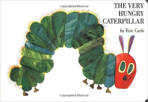
Module 2: The Very Hungry Caterpillar


(Photo courtesy of Amazon.com)

Summary: This book is about a caterpillar who is very hungry. Through the illustrations, children get to see just everything a little caterpillar might want to eat. It shows different colors and shapes through foods. The caterpillar is so hungry because it will become a butterfly.

APA: Carle, E. (2014). The Very Hungry Caterpillar. New York, NY: Philomel Books.

Review:
#2 The Very Hungry Caterpillar by Eric Carle (1979)
258 points

One of the very few pictures books that is just perfect – language appropriate, interactive, a great story, a counting exercise and a science lesson all rolled together. – Pat Vasilik
Carle is a genius, pure and simple. Is there a 5 year old alive who isn’t familiar with this book? The caterpillar is the poster child for greed. – DeAnn Okamura
Eric Carle is a genius, and without a doubt this is his greatest book. – Hotspur Closser
Concept book perfection. – DaNae Leu
One wonders if this book would have done quite so well on this poll had it been known by its original title: A Week With Willie Worm.  No.  I’m actually not kidding about this one.  Granted, “A Week With Willie Worm” is exactly the kind of fake title I would come up with if I were feeling cheeky, but back in the late 60s Carle thought this was a legitimate name to go with.  The whole caterpillar concept didn’t really occur at first.  We, the general public, got lucky.  Now we find ourselves nearing the end of the Top 100 Poll, and voila!  Here is the iconic insect with his big expressionless eyes and his frighteningly popular standing in the hearts and minds of adults and children everywhere.
The book’s description from B&N reads, “A caterpillar hatches out of his egg and is very hungry. On his first day, he eats through one piece of food; on his second, two, and so on. Little holes cut in the pages allow toddlers to wiggle their fingers through the food, just like the caterpillar. Vivid and colorful illustrations and ingenious layered pages help preschoolers learn the days of the week, how to count, and how a caterpillar turns into a butterfly.”
100 Best Books for Children discusses the Willie Worm dilemma, and places the credit of changing it to a caterpillar firmly in the camp of editor Ann Beneduce who suggested the switcheroo.  It is also interesting to note that, “Although no printer in the United States could be found to manufacture economically a book with so many die cuts, Beneduce located a printer in Japan who was able to produce the book.”  Apparently Carle got the idea for different shaped pages from the books he read when he was a child in Germany.
When asked in an interview with Metro.co.uk why the book was such a success, Carle had this to say: “My guess is it’s a book of hope. That you, an insignificant, ugly little caterpillar can grow up and eventually unfold your talent, and fly into the world. As a child, you can feel small and helpless and wonder if you’ll ever grow up. So that might be part of its success. But those thoughts came afterwards, a kind of psychobabble in retrospect. I didn’t start out and say: ‘I want to make a really meaningful book’.”  I like his use of the term “psychobabble”.  There’s also a truly wonderful Guardian article on Mr. Carle talking about his early years and discussing this book as well.  “The book’s success has spawned a lot of crank interpretations. It has been described as an allegory of both Christianity and capitalism. ‘Right after the Wall fell, I was signing books in the former East Germany and was invited by a group of young librarians to have lunch with them. One said the caterpillar is capitalist, he eats into every food one little bit and then the food rots away. Wasteful capitalist. Interesting. I think that if you’re indoctrinated, that’s how you will see it’.”  And if you’re looking for more there’s an older Guardian article that focuses entirely on the book that’s also worth reading.
Of course, back in the day children’s librarians were mighty sketchy on books that had “novelty” elements.  And with die-cut pages, no matter how cute they might be, I wondered if the old-time librarians had problems with this fuzzy green guy.  Leonard Marcus in Minders of Make-Believe seems to confirm my fears.  “The book quickly became a major commercial success, more so at first on the strength of its popularity with parents and preschool teachers than with librarians, who remained mistrustful of books with toylike elements.”  The Norton Anthology of Children’s Literature appears to be of the same mind.  Calling the title “a rudimentary game book”, it goes on to say that, “The imaginative use of collage and very bright colors are characteristic of the period.”  Huh.
Have you ever been to the Eric Carle Museum of Picture Book Art?  It’s a trip, but a trip that’s worth the travel.  I did a post about my own visit to the museum about a year ago and some of the pictures I took were wonderful Caterpillar-related shots.

Bird, E. (2012, June 28). Top 100 Picture Books #2: The Very Hungry Caterpillar by Eric Carle. School Library Journal. Retrieved from blogs.slj.com/afuse8production/2012/06/28/top-100-picture-books-2-the-very-hungry-caterpillar-by-eric-carle/

Library Use: This book would be a wonderful addition to any library, and it could help in teaching students about how hungry little caterpillars become beautiful butterflies. It works as a science book or as an introduction to colors, shapes, foods, and insects.

Wednesday, October 5, 2016

Module 1: It's A Book


(Picture courtesy of Amazon.com)

Summary: This wonderful short picture book is about a Monkey showing a Jackass what a book is. The Jackass is all about technology, and he has never really read a book. He constantly questions the Monkey, who is trying to read, about what a book can do. The Monkey and Mouse show him the wonder of books.

Impressions: This story is really caught my attention, mainly because of the choice of naming the donkey Jackass. This is a word that may cause some discussion amongst students. But, the story was really insightful, and it could be beneficial to students who are just being introduced to books and live in a modern era.

Review:
"In Lane Smith’s new book, called, simply, “It’s a Book,” a mouse, a jackass and a monkey — all drawn with the kind of early-’60s geometric-minded stylization that requires a gentle reminder of which animal is which on the title page — discover a new thing. Flat and rectangular, with a hard cover and a soft, yielding inside, it baffles the jackass, while the behatted monkey tries patiently to explain its curious technology. “Do you blog with it?” the jackass says. “No, it’s a book,” the monkey explains. This only makes the donkey’s exasperation keener: Where’s the mouse? Does it need a password? Can you make the characters fight? Can it text, tweet, toot? No, none of that, the monkey explains, and then Monkey hands the book to Jackass, who takes it worriedly, like a nut too hard to crack.

The book, it turns out, is “Treasure Island,” though, wisely, this isn’t explicitly announced to the reader, but must be inferred from a quotation. (In the book’s single finest comic moment, the anxious jackass offers a reduced text-message version of the famous sequence he has just read: “LJS: rrr! K? lol!

JIM: : ( ! : )”

Then, in a memorable two-page spread, sure to be especially cherished by parents, the jackass reads the thing. A clock runs above him, counting out the hours, and his ears and eyes, with wonderful caricatural economy, express first puzzlement, then absorption and at last the special quality of readerly happiness: a mind lost in a story.

Those of us for whom books are a faith in themselves — who find the notion that pixels, however ordered, could be any kind of substitute for the experience of reading in a chair with the strange thing spread open on our lap — will love this book. Though it will surely draw a laugh from kids, it will give even more pleasure to parents who have been trying to make loudly the point that Smith’s book makes softly: that the virtues of a book are independent of any bells, whistles or animation it might be made to contain. That two-page spread of the jackass simply reading is the key moment in the story, and one of the nicest sequences in recent picture books. 

For in trying to make the case for books to our kids, exactly the case we want to make is not that they can compete with the virtues of computer or screens, but that they do something else: that they allow for a soulfulness the screens, with their jumpy impersonality, cannot duplicate — any more than the movies can duplicate the intimate intensity of theater, or than the computer can reproduce the shared-hearth-in-living-room experience of television that we now, ironically, recall nostalgically. (“Would you please get off your computer and come and watch television with the rest of the family,” I’ve found myself calling out to my own plugged-in children.)

The moral of Smith’s book is the right one: not that screens are bad and books are good, but that what books do depends on the totality of what they are — their turning pages, their sturdy self-­sufficiency, above all the way they invite a child to withdraw from this world into a world alongside ours in an activity at once mentally strenuous and physically still.

The only flaw this gentle and pointed book contains, in truth, is a too-easy joke on the last page at the expense of the converted burro. But one can glide by the false note, or at least talk it over as it’s read — after all, it’s a book."

Gopnick, A. (2010, October 15). iRead. The New York Times. Retrieved from http://www.nytimes.com/2010/10/17/books/review/Gopnik-t.html?_r=0

Library Use: This book is a wonderful addition to any library, and I feel that many elementary students would benefit from reading and hearing this story read because it offers a definition of reading to them. It explains what a book is, and it shows them how much more useful it is to things like technology.